Overview
UOC plans to launch a mobile app in 2025 to enhance the online learning experience for its master's programs. This app will be a comprehensive, globally accessible digital platform, centralizing all program information. The primary goal is to design an app that meets the needs of both professors and students, making online studies more user-friendly and decentralized. It will support access to classroom information, facilitate the development of online studies, and integrate functionalities from other web portals, such as personal spaces and customer service.
My Role
Information Architect
Interaction Designer
Methodology
Scenarios
User journey map
Card sorting
Benchmarking
Prototyping
Duration
Sept 2023 - Jan 2024
Process
The research process involved several key stages, each critical for informing the design and functionality of the app.
Conceptualization and User Insights
Based on insights gathered from the client briefing, we developed a strong value proposition and crafted scenarios and user journeys based on thorough research findings. This approach enabled us to precisely define the design requirements and ensure that the app effectively meets real user needs right from the start.
Content Inventory and Card Sorting Study
To gain a clear understanding of all system content and its relationships, we defined a content inventory that served as a foundational guide for our design decisions. Building upon this groundwork, we conducted a semi-open card sorting study involving both users to refine the app's information architecture, prioritizing intuitive and user-friendly navigation.
Content Tree
Leveraging insights from the card sorting study, such as user preferences for grouping related content, we designed a content tree. This structured representation captured the finalized system structure and content organization, serving as a blueprint for further design iterations.
Flowchart Mapping and Navigation Analysis
Detailed flowcharts were created to map out various user scenarios within the defined system structure. Additionally, we benchmarked existing solutions and analyzed primary navigation flows to identify and incorporate industry best practices.
Low-Fidelity Prototyping
We then created sketches of the defined screens and flows to develop a low-fidelity, navigable, and interactive prototype, allowing stakeholders to visualize and interact with the app's functionality in its early stages.
Learnings
Based on the insights gained, we identified several key learnings when conceptualizing the interaction design:
Designing a unified calendar streamlines access to challenges across all subjects, eliminating the need for users to navigate different sections.
Highlighting challenges prominently and enabling direct access from the calendar enhances user engagement.
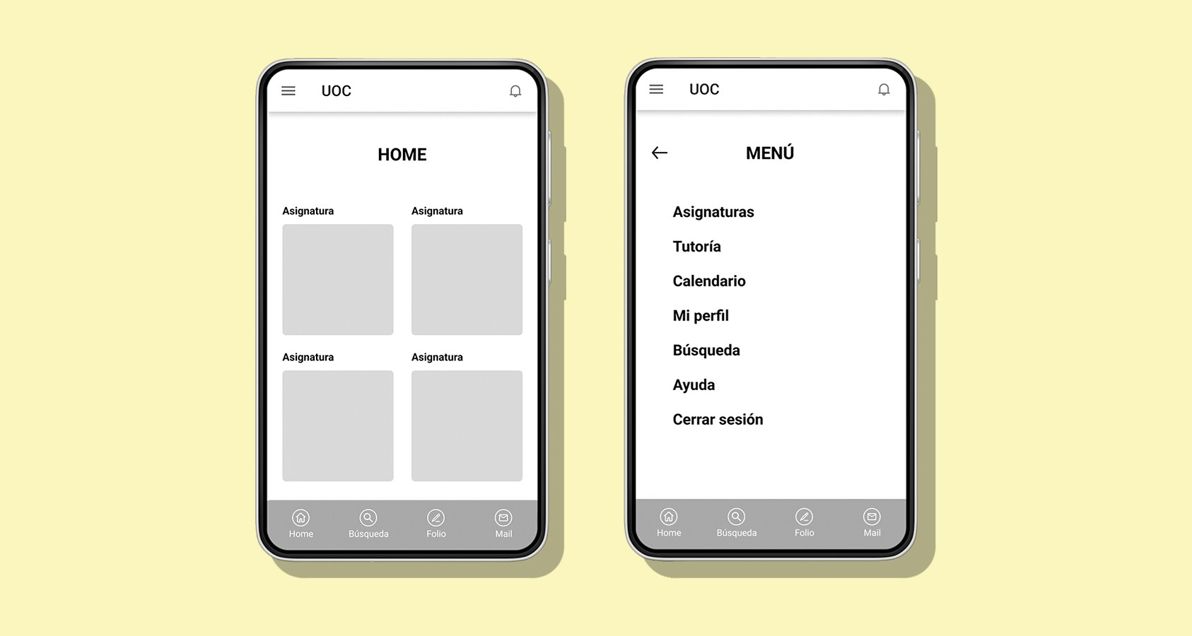
A clean menu layout that separates sections for easy identification will improve the navigation of completing a task on the app.
Users prioritize intuitive navigation and quick access to materials.
Providing an initial access choice, such as "Teacher" or "Student", ensures personalised content delivery by requiring users to select the option before entering their credentials.
Implementing a section to save drafts and schedule the publication of announcements throughout the semester will enhance communication effectiveness.
Outcome
The prototype has been designed to meet the needs of both students and teachers, offering specific options based on their profiles. Special attention has been given to accessibility and customization features, allowing users to adapt the product to their individual needs. These options will be available in the "my profile" section within the menu.
The application's design is simple and minimalist to enhance readability and learning of the content. Buttons and font sizes are sufficiently visible, and users can adjust them as needed. The notifications section has been relocated to the top menu bar to keep users informed about classroom notifications and ensure they are easily distinguishable.
Additionally, the application will offer offline reading capabilities and display progress for each subject through green badges on completed challenges, visible both in the calendar and subject sections. The application's most significant value proposition is to keep users updated at all times, access content from anywhere, and facilitate interaction among them. This enables smooth monitoring of subjects and aligns with the learning style at UOC.